
Medi-tech branding
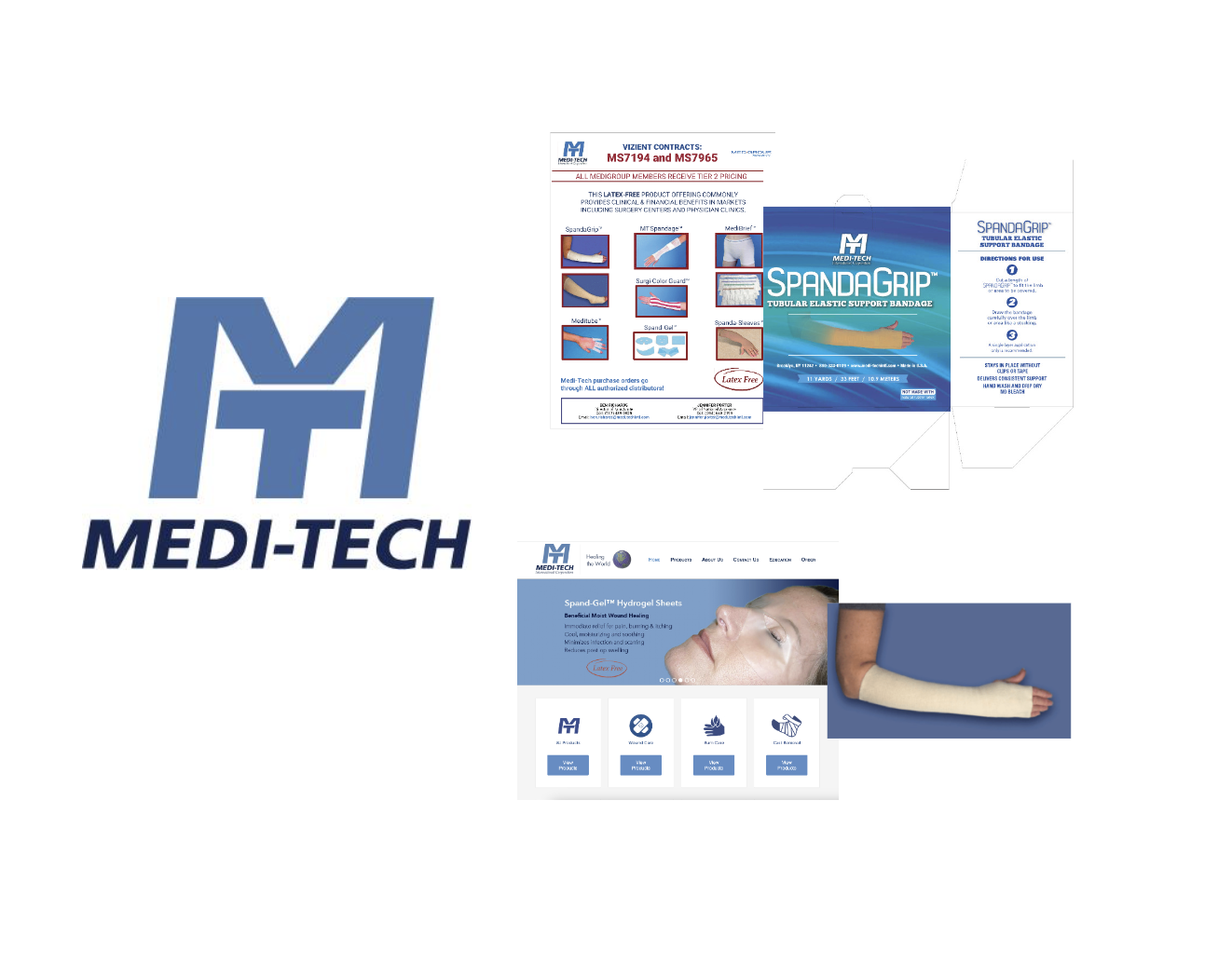
Following Marketlab’s acquisition of Medi-tech International, we identified a major opportunity to modernize a brand that no longer reflected the quality or innovation of its products. Spanning wound care, compression, and labor & delivery, the existing visual system—from branding and photography to packaging and audience touchpoints—felt dated and uncompetitive in today’s digital-first healthcare landscape.
I led the end-to-end creative rebrand at Marketlab, partnering closely with marketing and product management to translate a detailed creative brief into a cohesive, contemporary brand system. This included concept development, photography, packaging, and supporting brand touchpoints. I managed timelines and process, oversaw a team of two designers, and art directed an in-studio photoshoot with an external photo studio and hired models—ensuring the final work elevated product perception, improved clarity and hierarchy, and aligned with Medi-tech’s mission of enhancing patient care and professional efficiency.
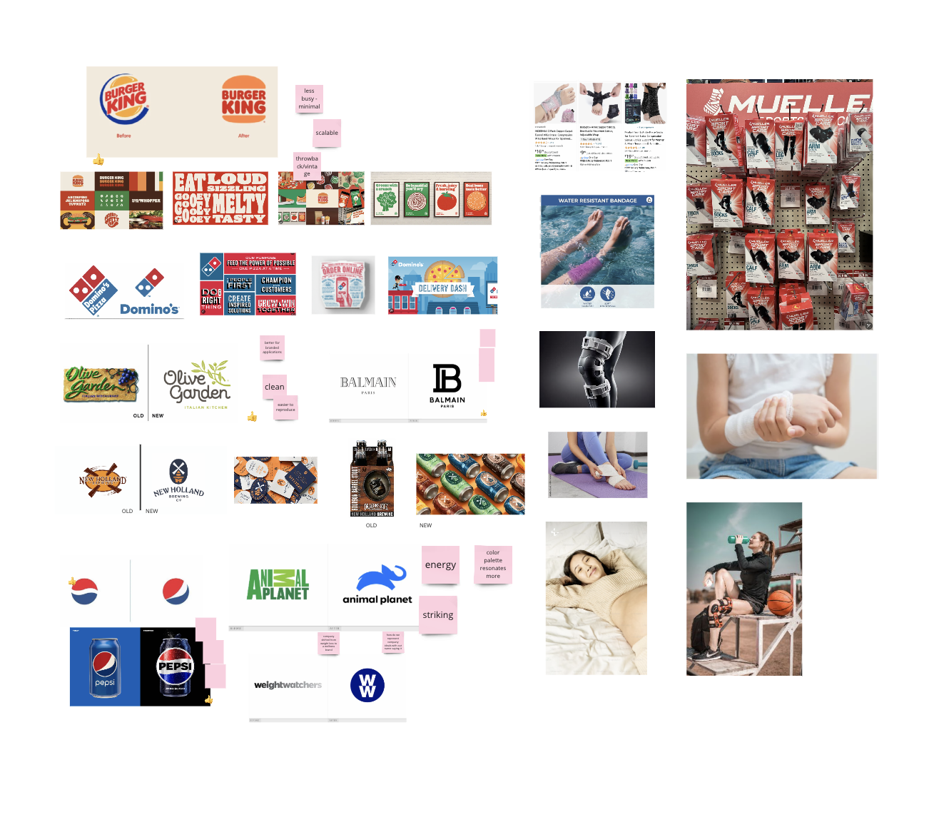
The project began with a detailed brief outlining our objectives, target audience, the brand's future vision and goals, competitors, and other relevant information. We initiated the design journey with an audit of Medi-Tech's current Visual Brand System, analyzing the logo, website, packaging, photography, and sales support materials. The aim of this audit was to identify areas for improvement, assess the needs of the rebrand, and gain a comprehensive understanding of the brand's overall direction. Our team then engaged in a deep dive working session, drawing inspiration from successful rebrands in the market and examining competitors. We concluded our research by cross-referencing our findings with the brief, focusing on how to visually represent the brand's vision, attributes, and goals in the new logo and brand system.
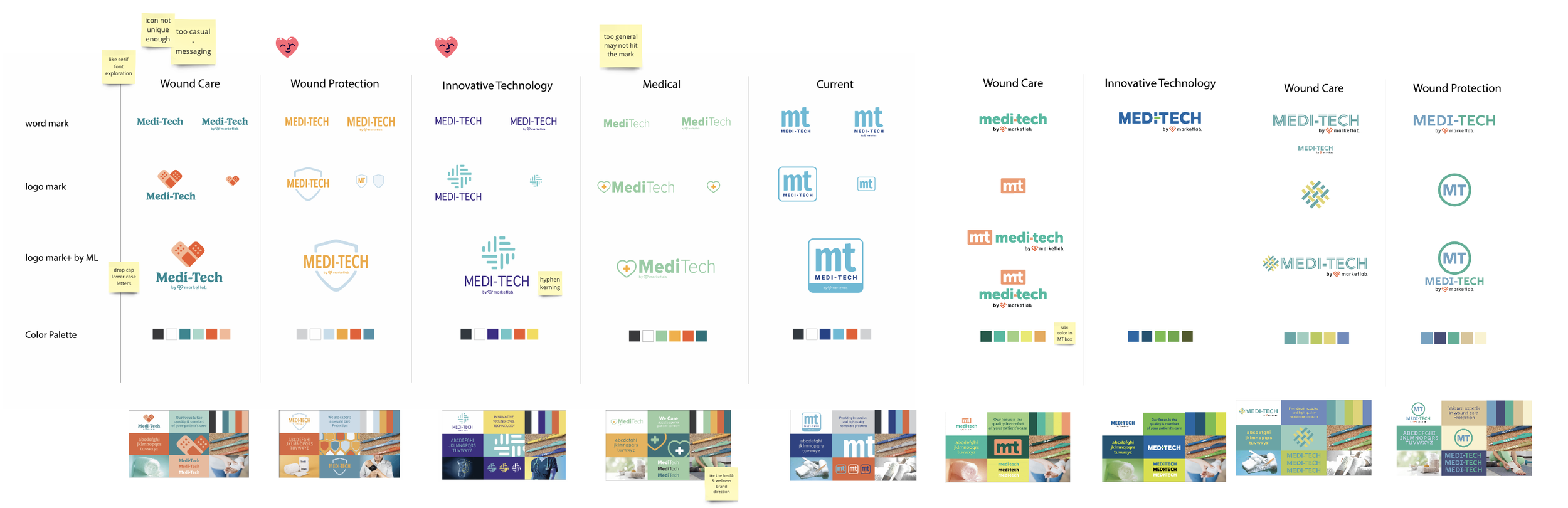
Each designer developed concepts based on the brief, and we engaged in a collaborative creative process where everyone contributed ideas and refined them together. We explored various solutions that addressed different aspects of the brief, including wound care, wound protection, innovative technology, and medical expertise. Our focus was to determine the number one thing we wanted this brand to represent to our audience and customers, ensuring a cohesive and impactful brand identity.
The new Medi-Tech logo embodies the brand's commitment to innovative technology and superior wound care. The design incorporates several key elements: the use of all lowercase letters makes the logo friendly and approachable, adding a touch of personality to the brand; the two different shades of blue maintain a calm and professional tone, evoking a sense of technical medical expertise; and the introduction of an icon pays homage to Medi-Tech's origins, reflecting the company's foundational invention of a unique mesh material, a technology that continues to be integral to many of its products. We believe this logo strikes the perfect balance between our themes of innovative technology and wound care, positioning Medi-Tech as a modern, reliable, and forward-thinking brand in the healthcare industry.
In designing the new Medi-Tech logo, we considered creating a "family" of logos to ensure flexibility and versatility. This includes variations that feature the icon alone, a single-color version, and a stacked logo format, allowing the brand to adapt to different needs and contexts.
For the color palette, while the primary logo color is blue, we wanted to introduce more warmth to emphasize the "care" aspect by adding yellow. Additionally, to align with our master brand Marketlab, we incorporated ML's orange and black as secondary colors. This cohesive color strategy ensures that the Medi-Tech brand remains connected to Marketlab while also highlighting its unique focus on care and innovation.
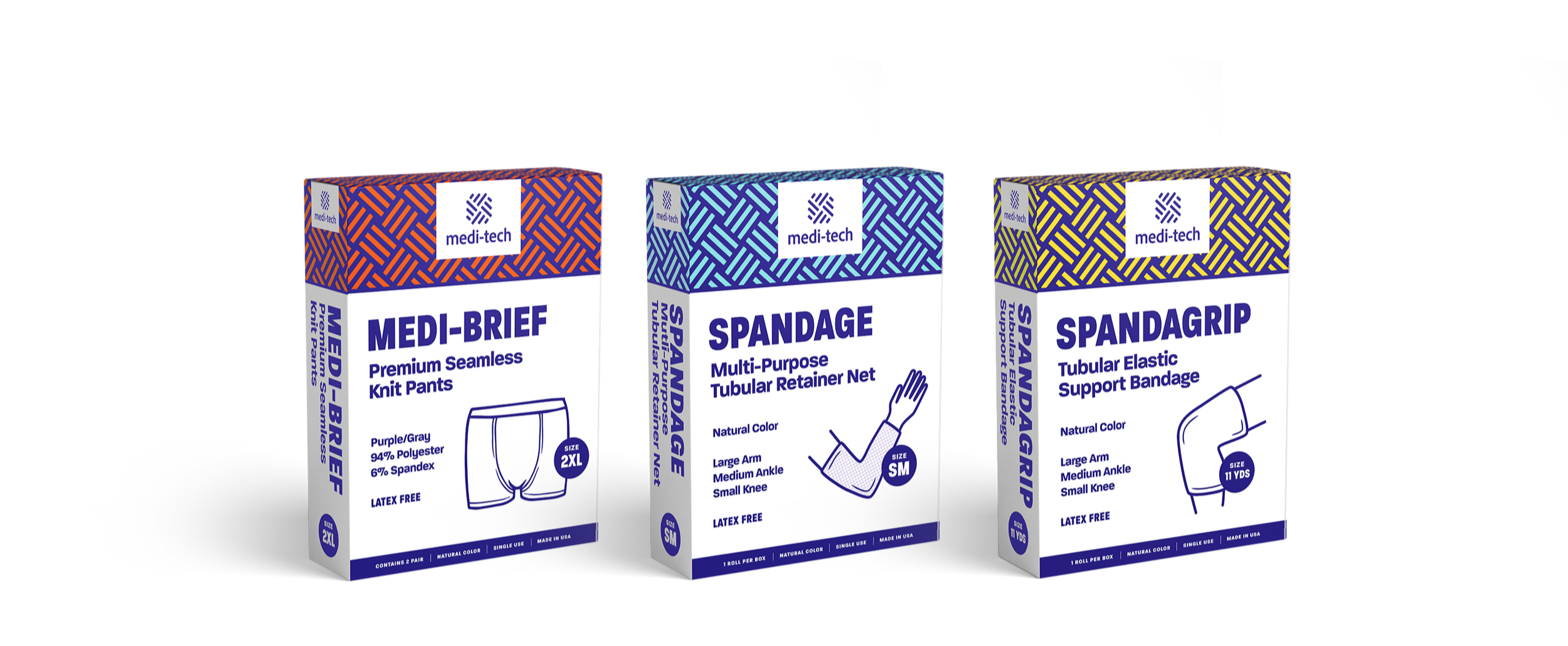
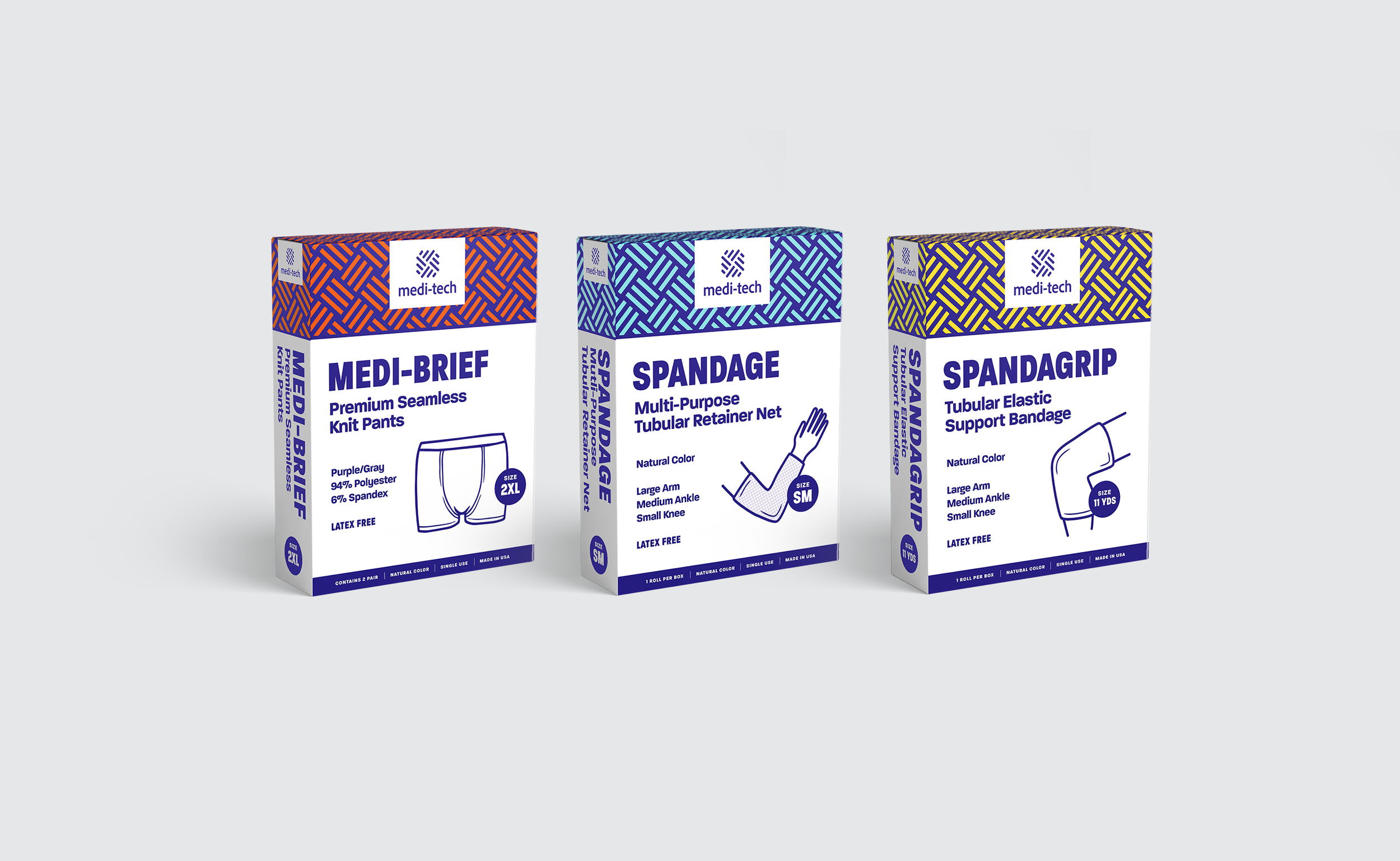
The packaging design for Medi-Tech products was developed with both distributors and the target audience in mind. Key considerations included making the product type easy to identify through a color-coding system based on product categories (e.g., Medi-Briefs, Spandage, Spandagrip). We also wanted to ensure that the product is visually represented on the packaging for easy identification and retrieval from storage shelves. Large callouts for size and color variations were included to accommodate the many options available.
To enhance brand recognition, we utilized the pattern from the logo across the packaging. Although the examples provided may not represent actual categories, different product types can be categorized by color for clarity. Our focus was on effective communication through the packaging, incorporating large product names, illustrations, and size callouts within a blue circle. This approach ensures that users can quickly and easily find the right product and size, even when stored in boxes on shelves.
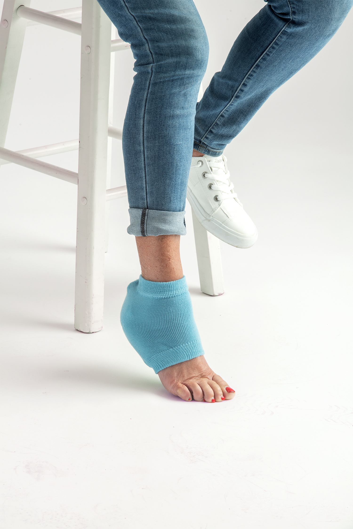
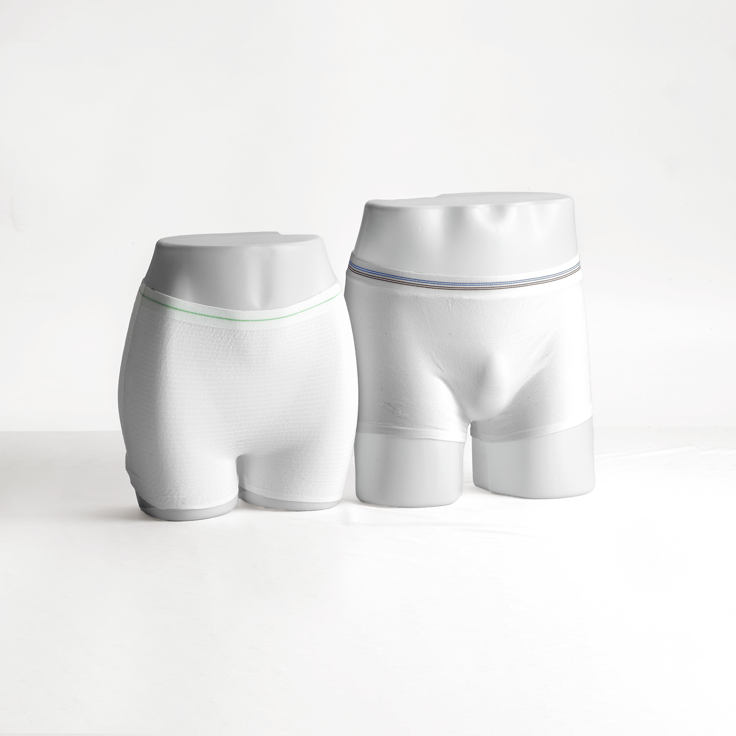
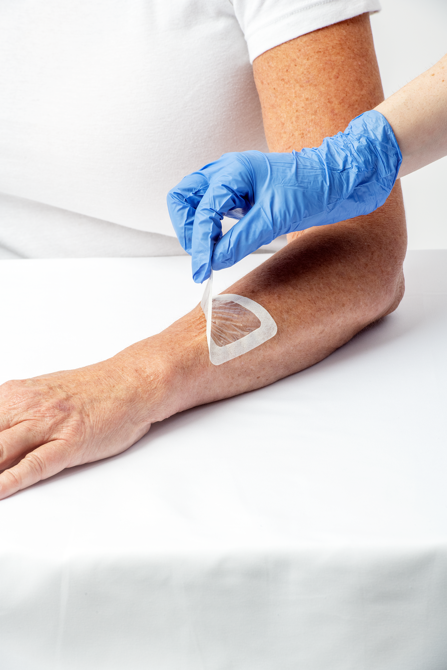
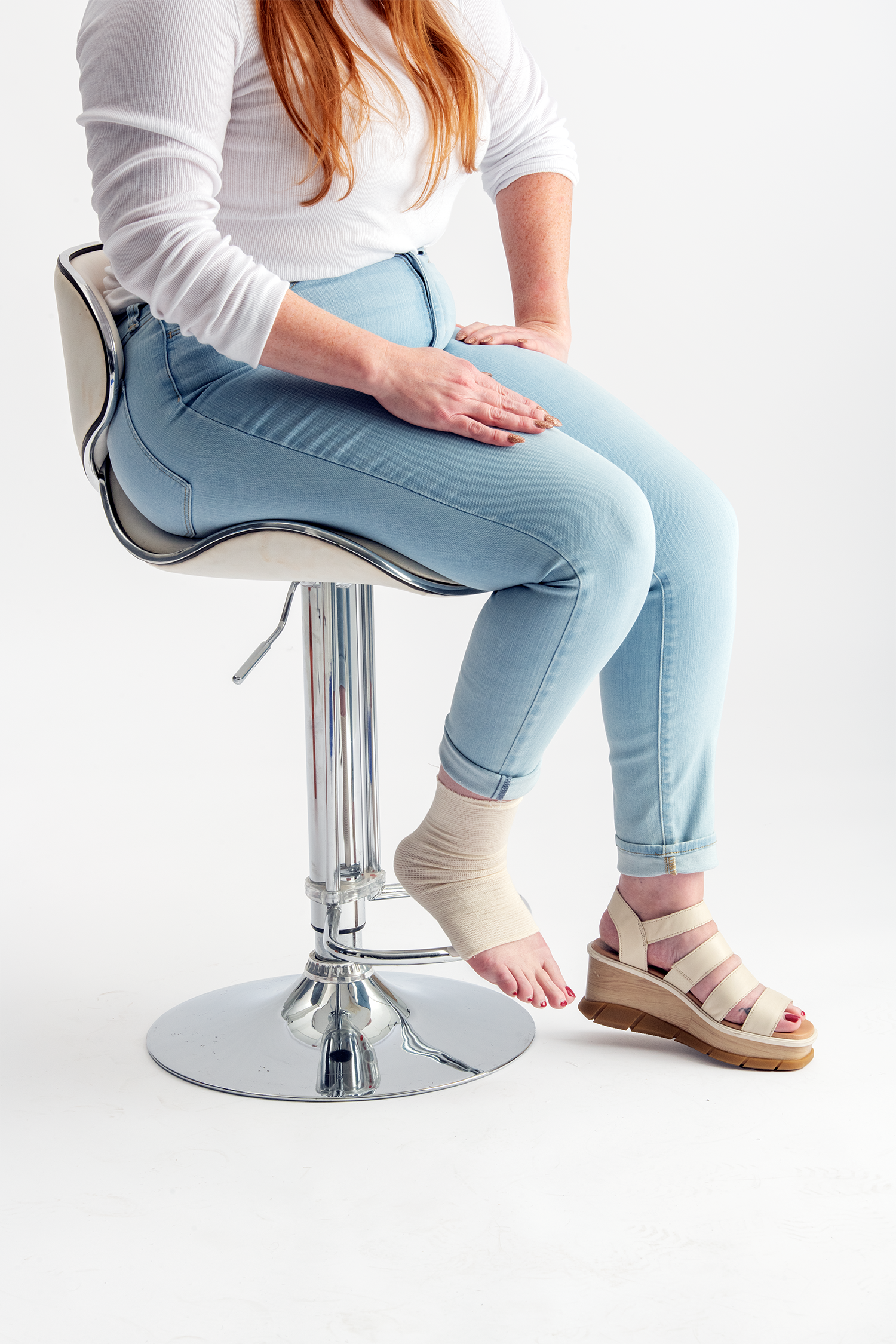
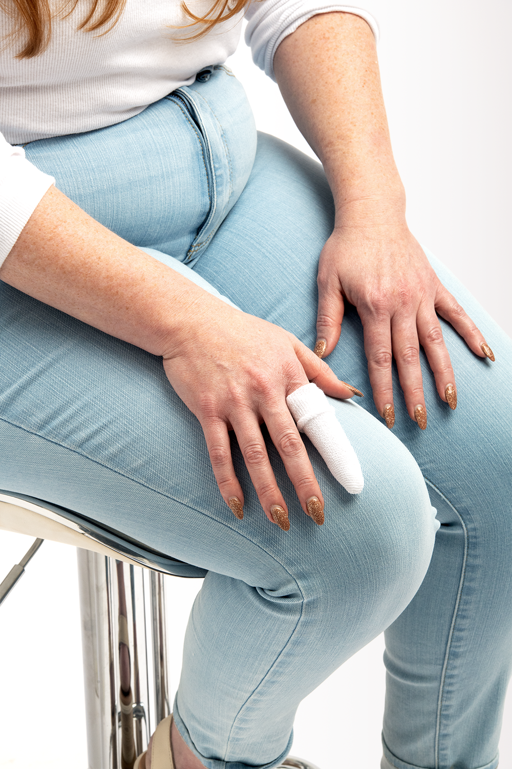
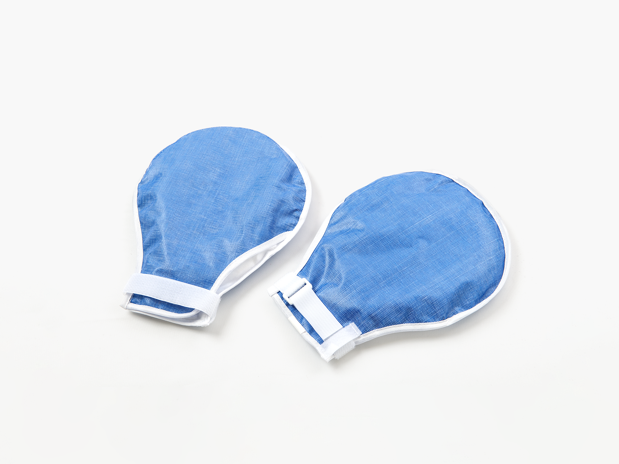
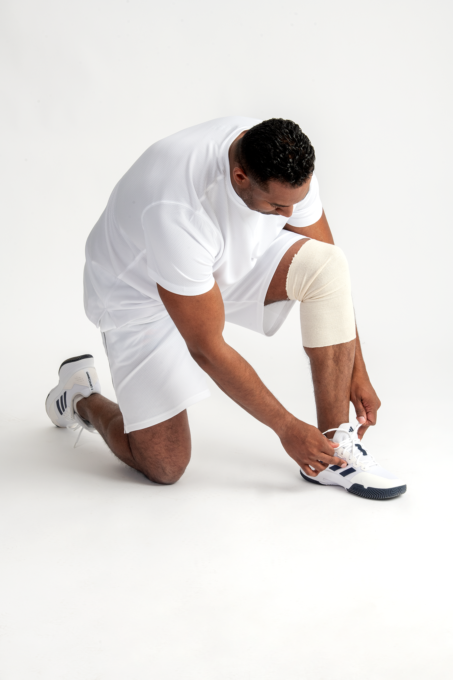

As part of the Medi-Tech project, I collaborated closely with the product management and marketing teams to coordinate a photoshoot aligned with our theme of “Innovative Healing.” Together, we developed a comprehensive shot list featuring top-selling products intended for rapid implementation across our website, sales materials, and trade show booths. On set with the photography team, I provided direction to ensure that the products were showcased in line with our vision. This hands-on approach allowed us to capture the essence of each product, emphasizing their functionality, fabric, and texture effectively.
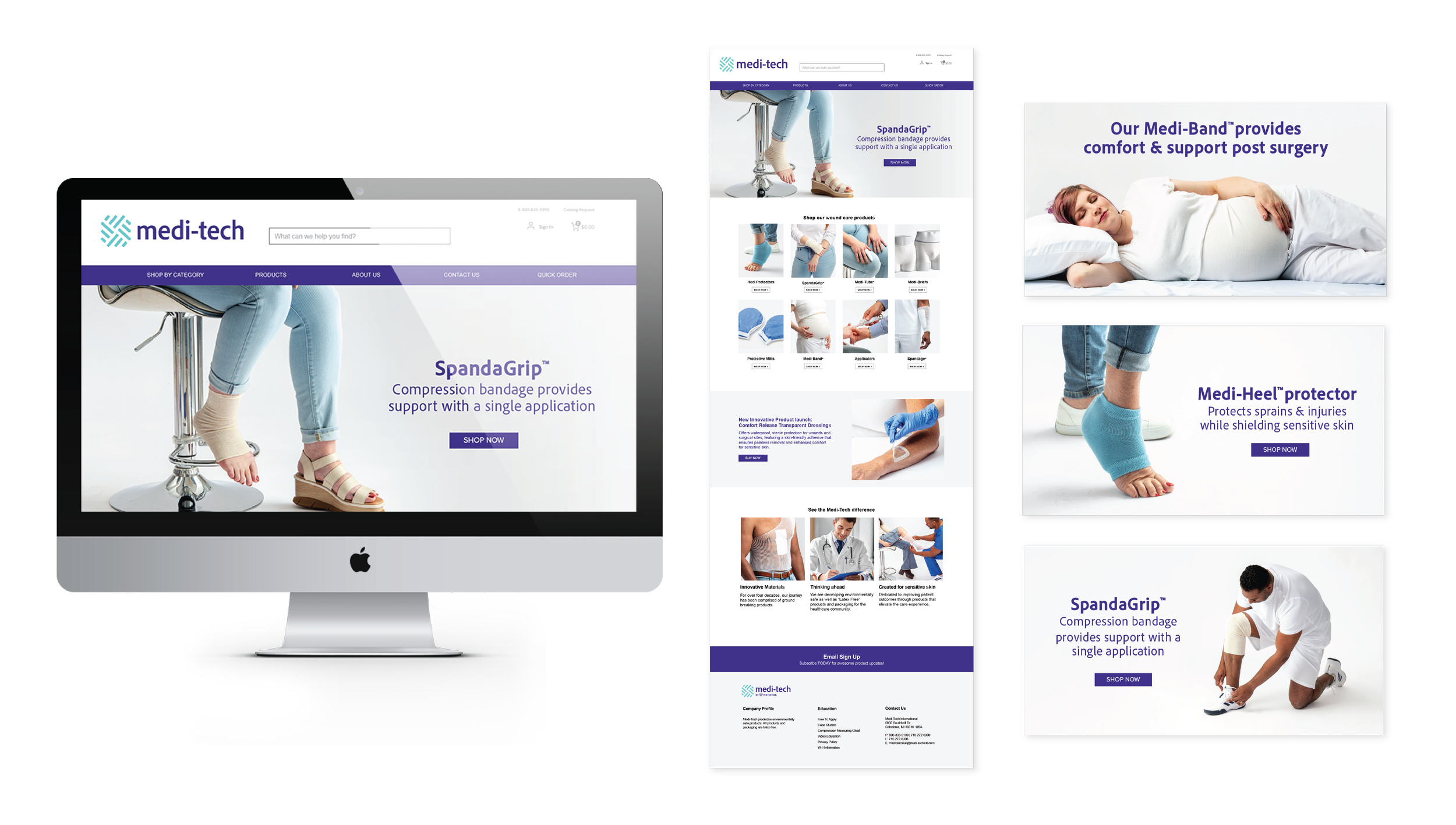
As one of the brand's largest external resources, we swiftly updated the website design to incorporate our new product photography. We aimed for a clean and bright design to appeal to our target audience, including doctors, ER nurses, physicians, and clinics. Through our visuals and design, we effectively advertise and promote key products. By integrating subtle branding elements and brand colors, we enhanced the website's vibrancy, brand recognition, and distinctive identity.
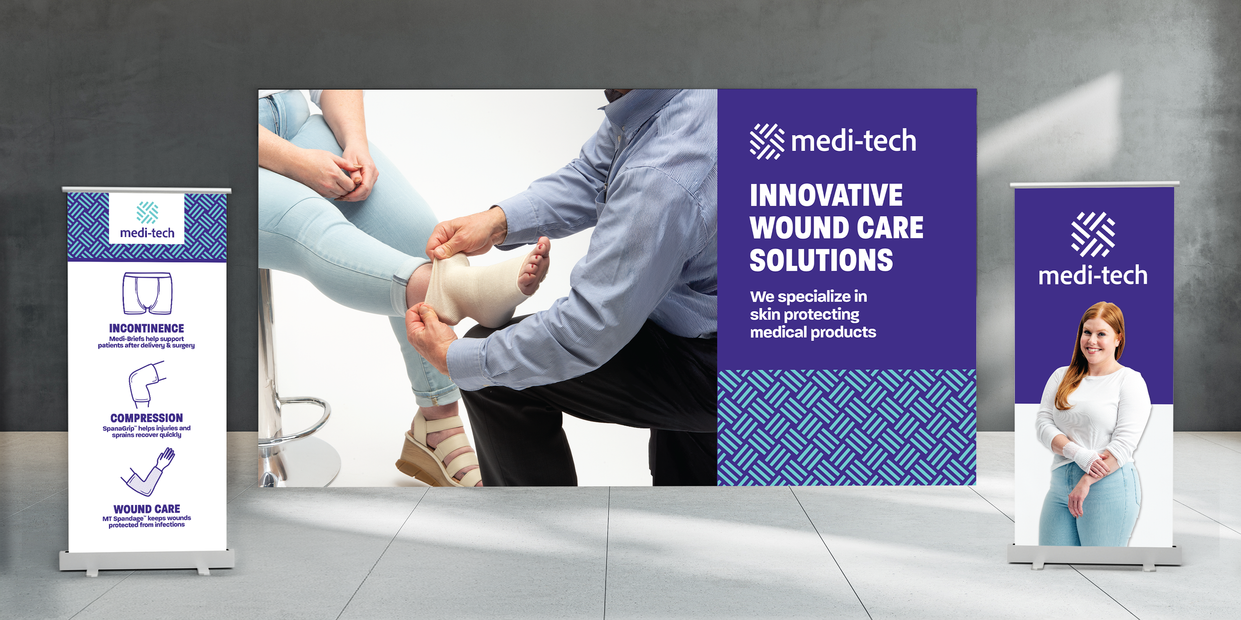
To expand the touchpoints of our new brand visual language, we designed new vertical banners and large backdrops for trade shows. These designs incorporate all the new brand elements, including photography, logo, color palette, pattern, and illustration. This approach provides a glimpse into how the brand will evolve as we develop additional touchpoints and create a cohesive, refreshed look within the brand system.